The Checkout button loads the Bolt Checkout modal when selected. Shoppers can manage their credentials, payment methods, and shipping options from the modal.
Merchants can either use Bolt’s default styling for greater cross-network shopper recognition or customize the Checkout button to fit their own brand requirements using the guidelines in this article.

Placement
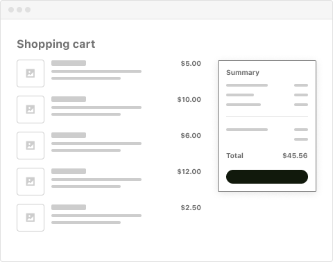
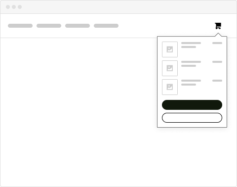
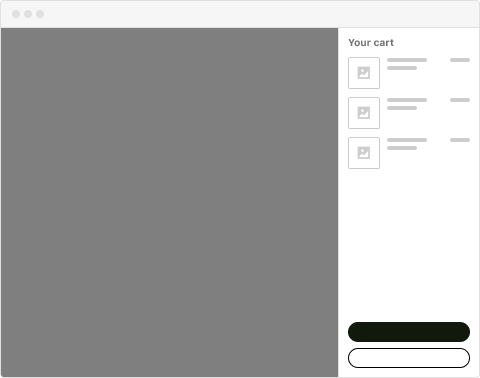
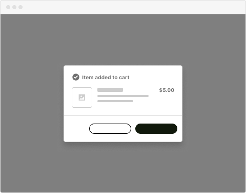
There are four acceptable placements for displaying the Checkout button. Each is listed in the following sections.
Shopping Cart Page
Mini-cart Popover
Mini-cart Sidepanel
Add-to-Cart Confirmation Modal
Size and Position
Default Style

Minimum Button Size

Height and Width
The Bolt Checkout button’s dimensions must be consistent with all other payment buttons displayed. If displayed alone, the Checkout button’s width must fill its container.

Vertical & Horizontal Layouts

Customization
Merchants can customize the following aspects of the Bolt Checkout button:
- Display Local or Alternative Payment Methods
- Bolt Icon
- Button Text
- Border Radius
- Text Font
- Button Color
- Additional Options
Display Local or Alternative Payment Methods
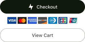
Merchants can display alternative payment methods as badges beneath the Checkout button.

Dos
Center badges beneath the Checkout button. Use secondary button styling when displaying additional actions (e.g. “View Cart”) across the UI, such as on the Mini-Cart page or in the Confirmation modal.
Don'ts
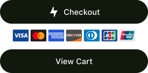
Do not stack payment methods if the Checkout button is narrow.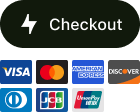 Do not use the same style for secondary buttons.
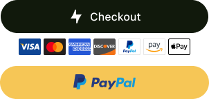
 Do not display a payment method badge for options with a dedicated button (as you can see, PayPal has a badge and a button).
 Do not alter the size of payment method badges.

Bolt Icon
Merchants can choose to either hide the default Bolt icon or display a lock icon instead.

Dos
The call-to-action text must be centered in the Checkout button if no icon is displayed.Don'ts
Do not change the position of the icon or text in the Checkout button.Button Text
The Checkout button displays Checkout by default. Ensure any custom CTA clearly indicates to shoppers that the Checkout button initiates the checkout process.
Dos
Provide actionable direction that sets clear expectations for the shopper.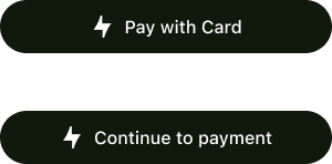
Don'ts
Avoid unclear CTAs that may confuse the shopper.
Border Radius
The Checkout button’s border-radius is 4px by default. Merchants can adjust this to match their storefront’s styling.
Dos
You can adjust the button to have square corners. You can adjust the border radius to create a rounded shaped button.

Don'ts
Do not alter the border radius to bring prominence.
Text Font
The Checkout button’s font-family is SF Pro Text by default. Merchants can update the font-family to match their storefront’s styling.
Dos
You can match your storefront’s primary font.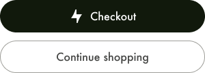
Don'ts
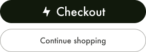
Avoid choosing a font that is not consistent with your brand.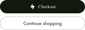 Avoid inflating the font size to add prominence to the Checkout button, especially if the selected size is not consistent with the storefront’s styling.
Button Color
The Checkout button’s background-color is Bolt blue (#006CFF) by default. Merchants can update the background-color to be consistent with their brand. Bolt recommends verifying that your color choice passes accessibility requirements by visiting https://accessible-colors.com.
Dos
You can update the button’s background color to match your storefront’s primary call-to-action styling.
Don'ts
Avoid using background colors that are not accessible and inclusive to all shoppers. Do not use Bolt’s red (`#FF4F50`) as your primary call to action button color as it might collide with Bolt’s warnings and/or error call outs.

Additional Options
| Name | Type | Example |
|---|---|---|
| background | String; accepts hex, rgba | #FFFFFF rgba(255,255,255,0) |
| background-hover | String; accepts hex, rgba | |
| letter-spacing | em or px | 0.1em |
| font-color | String; accepts hex, rgba | |
| font-family | String; accepts list of fonts | Roboto, sans-serif |
| font-size | String | 16px |
| font-weight | String | bold |
| height | String; can be pixels or percentage for dynamic | 100px, 100% |
| width | String; can be pixels or percentage for dynamic | 100px, 100% |
| border-color | String; accepts hex, rgba | #fff |
| border-color-hover | String; accepts hex, rgba | #fff |
| border-width | int | 2 NOT 2em or 2px (svg can’t support) |
| border-width-hover | int | 2 NOT 2em or 2px (svg can’t support) |
| border-radius | int | 2 NOT 2em or 2px (svg can’t support) |
